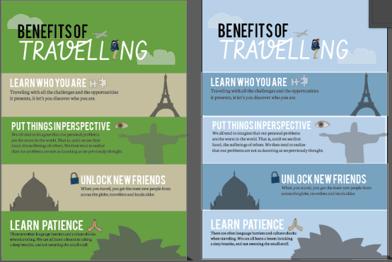
I have decided to come down to two colour.
The green one or the blue one? The green one is more of a nature aspect, for example when you go travelling you get to see the beauty of other cultures and the nature they have to offer. But the second one it shows the colour of travelling and being up in the sky. The sky is blue, so I put down 2 different colour of hues of blue to keep the consistency.

I think your vector art looks really cool, like how you’ve incorporated the tourist vector you had from your WIP ages ago – it’s a creative way of putting it in. A suggestion would be to maybe increase the spacing between some of your titles? It’s mostly just the second one where ‘in’ and ‘perspective’ look like they’re one word. Both of these colour schemes look good though, like you say, the green kinda reminds you of nature whilst the blue is evocative of the sky and flying to your destination.
LikeLike
Yohanna these are looking really good! I like how you have segmented every element so it is very clear and visually balanced. I think personally the blue is nice – as you said it’s reminiscent of flying and being up in the air. I also think that it looks more ‘fresh’ and feels like a more uplifting and persuasive colour. Not sure if that’s just my opinion…just one thing that I think that needs to be adjusted is maybe alternating which side the text and images of the landmarks are on. At the moment there are 3 on the right and one on the left. I think that if you have an even amount the image will look more balanced. Apart from this I think that this is looking great – I would love to go travelling now after looking at this infographic 😀
LikeLike
I really like what you’ve got here. Both versions look great but I think the blue one might work better. It works well to represent the sky but it also seems a bit more calming. Although I can’t tell if the the white border around the rows in the blue image are meant to be there or not? If it was just used to break up the rows a bit it would be fine.
LikeLike
I really enjoy the progress you’ve made on your infographic! i do prefer the blue background over the green, the blue is definitely softer to the eye and even emphasizes the thought of travel and the sky to me. I also really love the fonts and the images you chose to portray each section. If I were to suggest on thing however, I would say to put the images almost as a background in each description section rather than on the side. Since the images don’t directly relate to the wording it would be nice to have them in the background rather than as their own entity within each descriptive section. Besides that great job!
LikeLike